CDW 2026: What commercial spaces can learn from hospitality
What Clerkenwell Design Week 2026 teaches us about the death of the look-but-don't-touch showroom, and why the future of B2B spaces belongs to hospitality.

If you walked around Clerkenwell Design Week this year, you could feel a shift in the air. The spaces that really stuck with the team here weren't necessarily the ones crammed with the most products, biggest displays, or loudest graphics. Instead, there was a clear divide between the brands running traditional, look-but-don't-touch showrooms and the ones creating spaces you actually wanted to hang out in.
It turns out B2B buyers don't leave their human instincts at the door. The biggest takeaway this year was a lesson in psychology – great design environments are borrowing heavily from hospitality and wellness. The spaces that won us over treated us like guests, rather than just another lead to scan.
From ‘look at everything we make’ to ‘come on in’
Wellness has been an industry buzzword for ages, especially in surfaces and flooring. But this year, the brands making an impact moved past just talking about wellness principles and focused on making people actually feel it.
“Across the flooring category in particular, wellness continues to be a dominant theme. However, brands are increasingly interpreting this in different ways, moving beyond simply designing for wellness and instead creating experiences intended to actively make people feel wellness.”
Neil Sheakey, Senior Brand Strategist
Modern professionals are tired of being talked at. They don't want to stand passively on a showroom floor, politely nodding at graphics while a rep pitches to them. They want context, atmosphere, and a bit of human interaction.
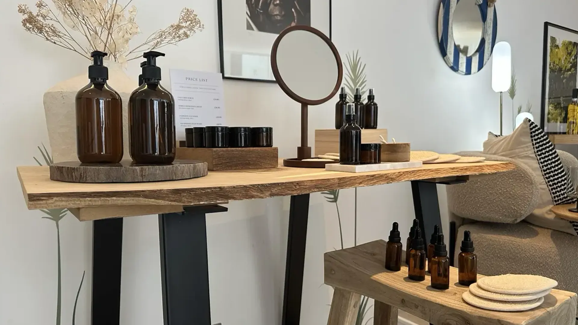
The Amtico Retreat was a perfect example of this. Our team flagged it as a massive highlight because it bypassed the standard corporate walkthrough. It was designed as a calm, purposeful oasis away from the frantic energy of the main festival.
Instead of handshakes and presentations, they put the product literally in our hands. Visitors got to create their own LVT coasters and get stuck into a light-hearted design competition.
“You were not standing passively receiving information from a stand representative or reading wall graphics while politely nodding. The activity became the conversation starter. Questions happened naturally. Ideas were shared. People compared approaches and talked about applications and possibilities without it feeling like a presentation. The product became easier to understand because it had context.”
Joy Pendleton, Client Services Director
Giving the story room to breathe
There is a lot of power in stripping things back. In sectors where it can be tough to visually stand out, the brands that cut through did it by prioritising a high-quality, spacious environment rather than trying to display every single product line at once.
- Villeroy & Boch & VitrA: Both spaces stood out by keeping things open, polished, and beautifully curated. Because they focused on a clear, premium aesthetic journey rather than a crowded inventory checklist, their spaces felt elevated and gave them a real point of difference.
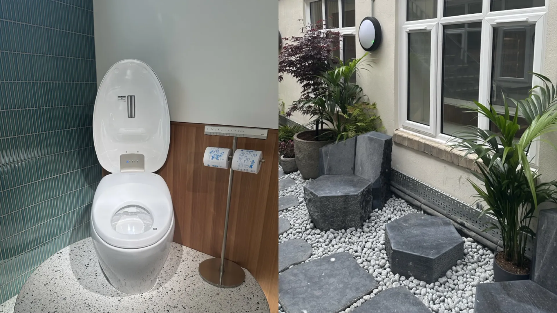
- TOTO: They leaned straight into their technical depth and Japanese heritage. But instead of just printing specs on a board, they built an experience around it – blending live technical demonstrations with a gorgeous, physical Japanese garden installation in their courtyard.
When your brochures, digital comms, and physical spaces all tell the exact same story, the credibility takes care of itself.

The bigger picture
This shift at Clerkenwell points directly to what is happening in modern workspace design: the commercial workplace is becoming akin to a hospitality destination. Just as event spaces need to offer more than just a product catalogue to keep people engaged, the modern office needs to offer more than just a desk and a chair to get people to commute. Employees and clients alike are looking for spaces rooted in comfort, connection, and wellbeing.
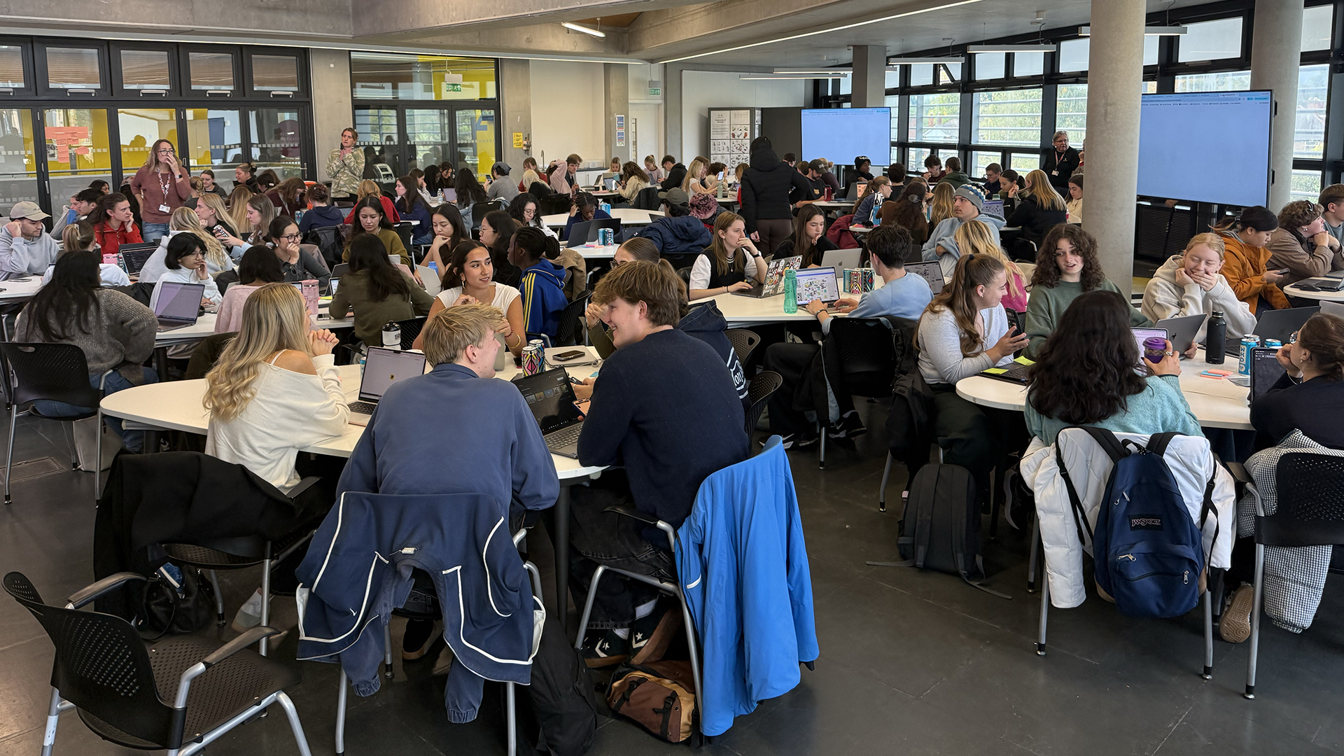
This was backed up at a panel discussion on designing for a workforce that doesn’t fully trust the office anymore.
“People are horrified now if they see an office plan with just desks.”
Joanne Sanger, Resonate Interiors
And fellow panelist Mijail Gutierrez of Perkins + Will showed just how much expectations have changed, noting that the balance has swung heavily towards collaborative ‘we’ spaces over individual ‘I’ spaces, often sitting at a 60/40 split – a truly radical shift in only a few years.
Whether you're planning a temporary pop-up activation or rethinking a permanent office space, the rule of thumb remains the same – give people a reason to participate, hold the product, and start a real conversation.
Key outtakes
- Curate, don't collect: Pick one clear story or feeling and commit to it. Clear out the clutter so your message has room to breathe.
- Make it tactile: How can you turn your service, product, or data into a hands-on moment that gets people talking naturally?
- Connect the dots: Make sure the experience is seamless – from the very first invite to the take-home brochure and the physical space itself.