Breaking into a crowded category
The gin boom created a crowded, competitive market, dominated by established brands with deep pockets and strong distribution.
Bedrock Gin had the quality, the provenance and the backing of its local community. But to compete at scale and secure national listings, it needed a brand that could stand shoulder to shoulder with the category’s biggest names.
Local provenance
Bedrock’s Lake District provenance offered a clear point of difference. In a saturated category, that sense of place gave Bedrock something distinctive to draw from.
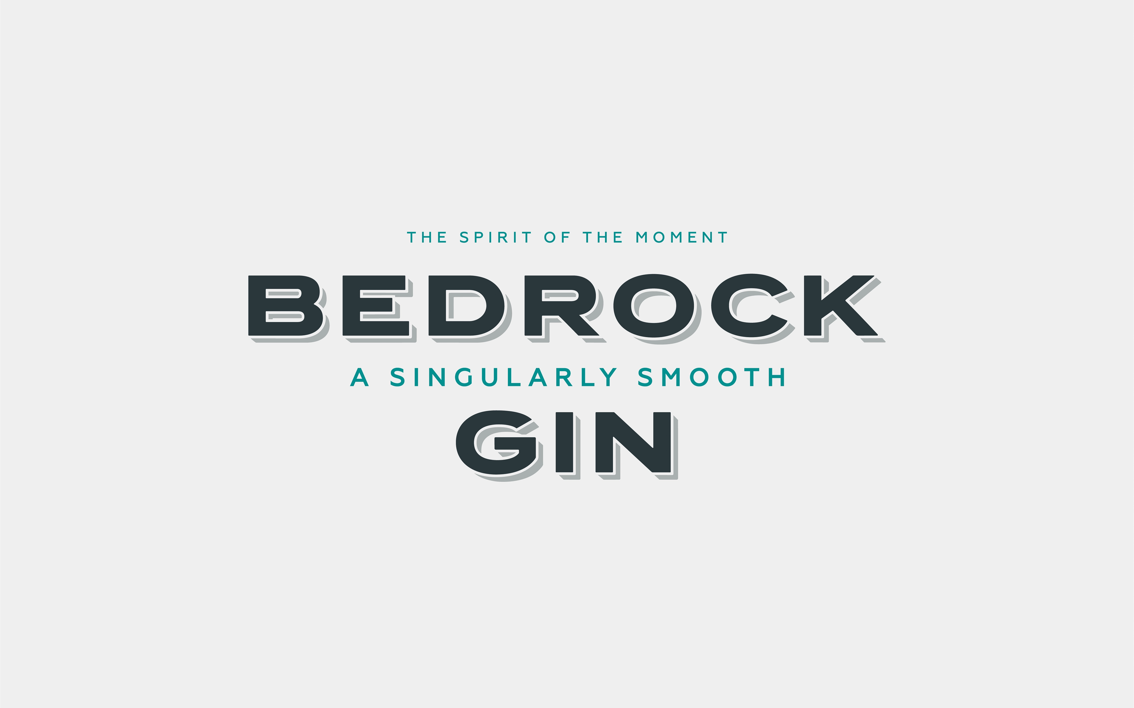
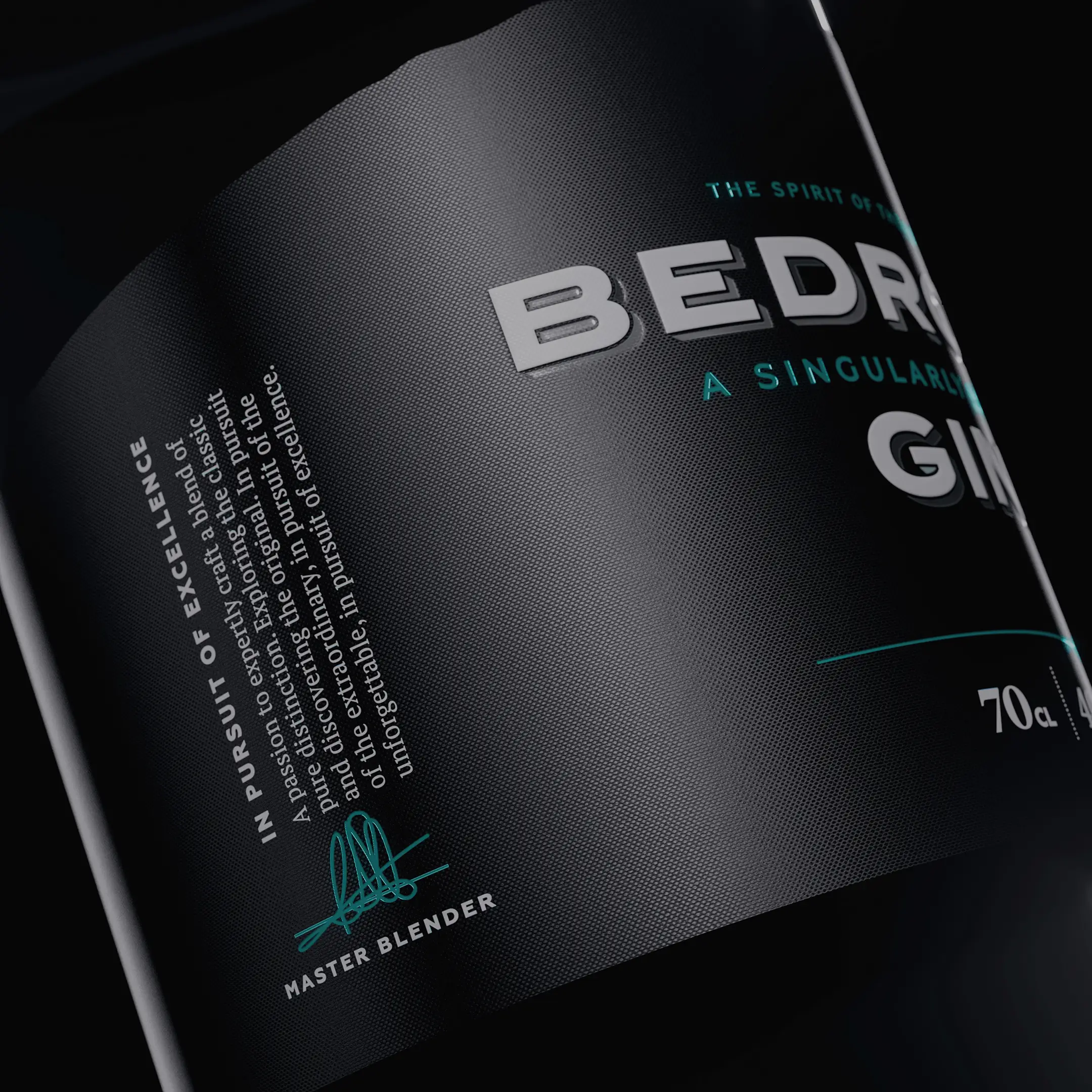
Built from the landscape
‘The Spirit of the Lakes’ brings Bedrock’s origins to life.
A refined visual identity draws on topographical lines, embossed textures and distinctive markings inspired by the rugged landscape. The result is a premium, tactile design system that feels as considered as the liquid itself.
Delivered across packaging, digital and film, the brand creates a striking presence designed to stand out on shelf and live beyond the first pour.
Nationwide credibility
The new identity gave Bedrock the confidence and credibility to compete at a higher level. It secured listings with major retailers and distributors, including Booths, Ocado, Matthew Clark and Master of Malt – transforming Bedrock from a local challenger into a recognised name in a fiercely competitive market.